yifan wang
Raidou Kuzunoha Logo Redesign
(disclaimer: copyrights of all images that uses the 'Devil Summoner' 'Raidou Kuzunoha' monikers on this site belongs to Atlus and SEGA, do NOT use any of my redesigns OR original images without permission)


Logo redesign for both of the Devil Summoner: Raidou Kuzunoha games (English version). Goal is to improve readability against a more colorful background for stream layouts, and stick to the general visual identity of the series (OG Japanese Version).


The OG English logos use the title 'Shin Megami Tensei - Devil Summoner - Raidou Kuzunoha vs ***' that's lengthy and unnecessarily wordy. 'Devil Summoner', which is rather a franchise or main series name, is picked as the headline. The decision to use cursive in addition to a cracked texture decreases the readability. Fans and players mostly refers to these games as 'the Raidou games', so I wanted to use 'Raidou Kuzunoha' as the headliner, who is also the iconic main character of the series.


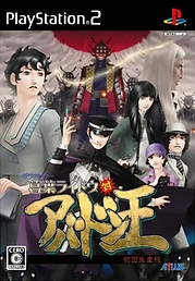
I like the design and font choice of the English logo from another game of the 'Devil Summoner' series Soul Hackers (which also have the 3 title issue unfortunately, my guess is that Atlus West at the time really wanted to push the 'SMT' super franchise brand visibility). I used that as the baseline visual reference and picked the same base fonts for brand identity of the actual series 'Devil Summoner'. The Japanese logos are actually very clear and easy to read, and has a manga feel to the box art which. So I gave similar treatments to tie it back to its roots, including the subtle cloud texture on Soulless Army, gold foil texture on King Abaddon, and same sticker on VS as 対.

final image for the pause screen for stream