yifan wang
SMT4 Apps Skill Progression UI Design
(disclaimer: copyrights of all images that uses the sprite images from the SMT series on this site belongs to Atlus and SEGA, do NOT use any of my redesigns OR original images without permission)
User Interface framework redesign for the App skill progression system for Shin Megami Tensei IV. Goal is to improve efficiency and readability, and lean in to the 'App' and 'demon summoning device' (phone) perspective in the world building. I referenced designs from modern phone app interface, and added the sprite of Burroughs, the AI program who's helping and guiding the player throughout the main story campaign.

Tier 1 interface - Main menu - Different categories as app folders

Tier 2 interface - Sub menu - Apps in each categories

Tier 3 interface - Sub menu - App details and upgrading interface
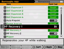
The Apps interface in the OG game is just a list of all the skills available for purchase and each upgrade tier was treated as a separate entry, which is usable, but clustered. Also sometimes in my playthrough I wish I knew what apps would be available so I can manage my app points better, since there were instances where in end game I wish I had spent my points on certain skills didn't know earlier.


OG Apps Interface as a list - only broad categorization on the different icons
I started with categorizing all the apps into four main groups, and consolidating skill tiers into the same entry as 'upgrades' to make the UI less clustered and easier to understand and navigate. Then I also broke down some of the skills into 2 parts such as 'stock-expansion' / 'skill-expansion' / 'skill-smoother(efficiency)' / 'stats-enhancer' so it'll be easier to design and read the icons, with the expansion / recovery / efficiency / enhancer being a corner elements, and the tier level being another corner element.

Apps skills categorization sheet

Icon design explorations


Other app groups exploration